Sector
Lifestyle
Client
Primera
The Hub of the Neighborhood
Starting with a workshop, not a sketch
Primera's journey to a new concept began with a deep-dive workshop into the needs of the brand, its franchisers and its customers. The outcome set the direction for everything that followed: reinforcing Primera's position as a neighborhood hub, a place where everyone feels welcome, whether they come for a card, a parcel or a quick chat.
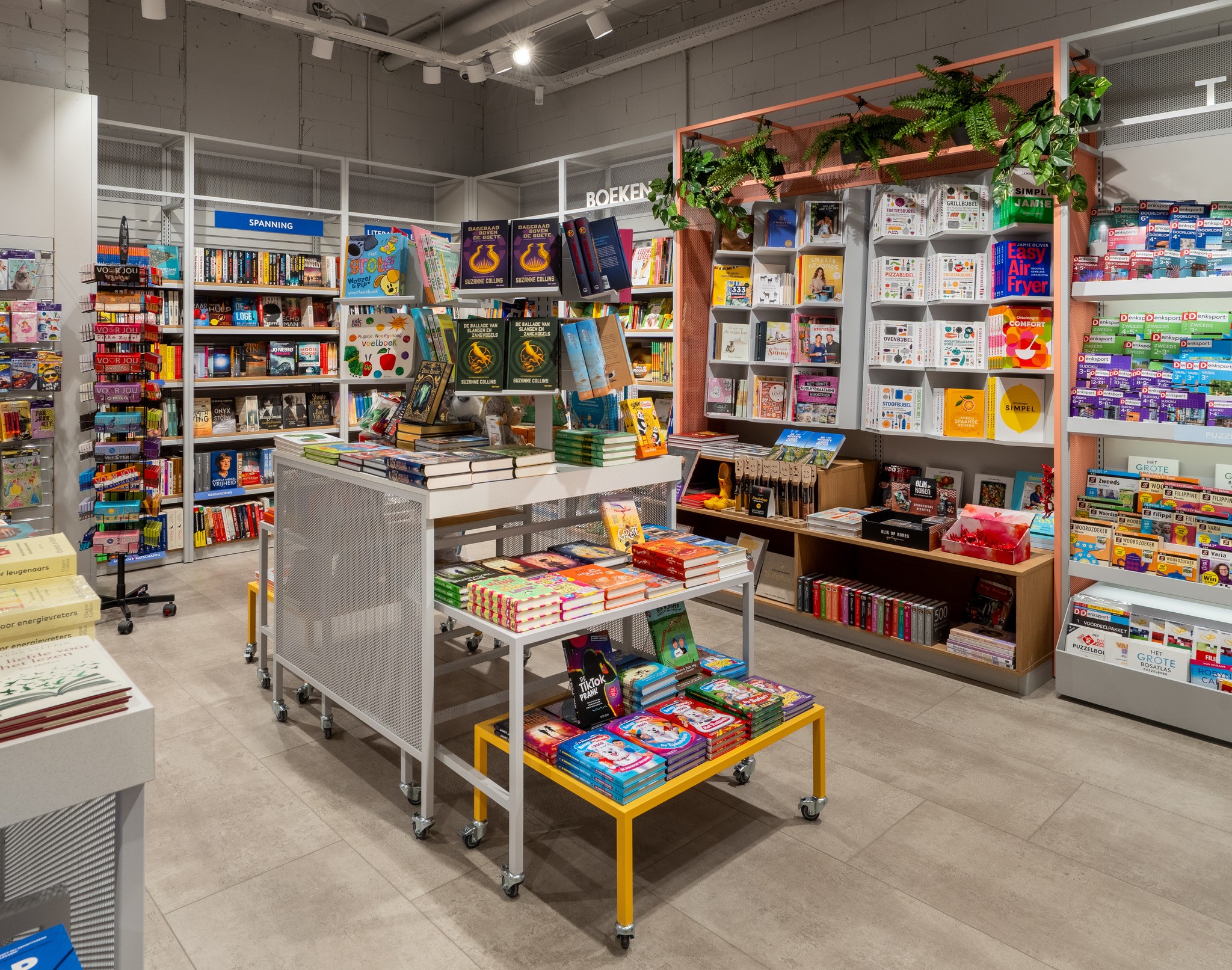

A familiar brand, a fresh palette
We translated that ambition into a fresh, vibrant colour scheme. The classic Primera blue and yellow stayed, because recognition is the brand's biggest asset, but we added bold patterns and a soft pink for a playful, unexpected touch. A soft blue was chosen deliberately to reflect the high level of service customers can expect in store, tying the palette back to the brand promise.
From concept to execution
With the design set, we engineered the concept for multiplication. Furniture, displays and in store communication were specified in a complete format manual, covering materials, dimensions, suppliers and planograms per store type. We then managed the full rollout: site surveys, remodeling planning per location, supplier coordination and on site implementation, with value engineering along the way to keep cost per store under control. Learnings from the first conversions were fed back into the manual, so every next store opened faster, sharper and unmistakably Primera.


Contact us
Like what you see? Send us a message to find out what we can do for you